
5 Website Design Do’s & Don’ts: A Strategic Guide for Equestrian Brands
Updated: Janaury 2026
A website is the foundation of your equestrian brand’s digital presence. It is the first impression for new clients, the reference point for sponsors, and the central hub for everything from sales to storytelling. Yet too often, equestrian websites fall into the trap of looking good on the surface while failing to perform as strategic business tools.
This difference is especially stark when you compare equestrian sport to mainstream global sports like football. Footballers rarely need a personal website. The industry’s media rights, broadcast deals, and social media machinery ensure their names stay constantly in circulation. Equestrian athletes, however, cannot rely on billion-dollar ecosystems to generate visibility. For them, a website is not optional. It is essential owned media, providing a permanent and professional showcase that social media alone cannot replicate.
Research highlights how high the stakes are. More than 50 percent of users say they would not recommend a business with a poorly designed mobile site, and loading delays of just one second can reduce conversions by up to 7 percent. In equestrian sport, where competition is fierce and credibility is everything, these small design oversights can be the difference between attracting new business or being dismissed in seconds.
Here we reframe the classic “10 do’s and don’ts” into five strategic principles. Each combines design, usability, and marketing strategy, showing not just what to avoid, but why it matters for growth in 2026 and beyond.
1. Performance and Mobile Optimisation
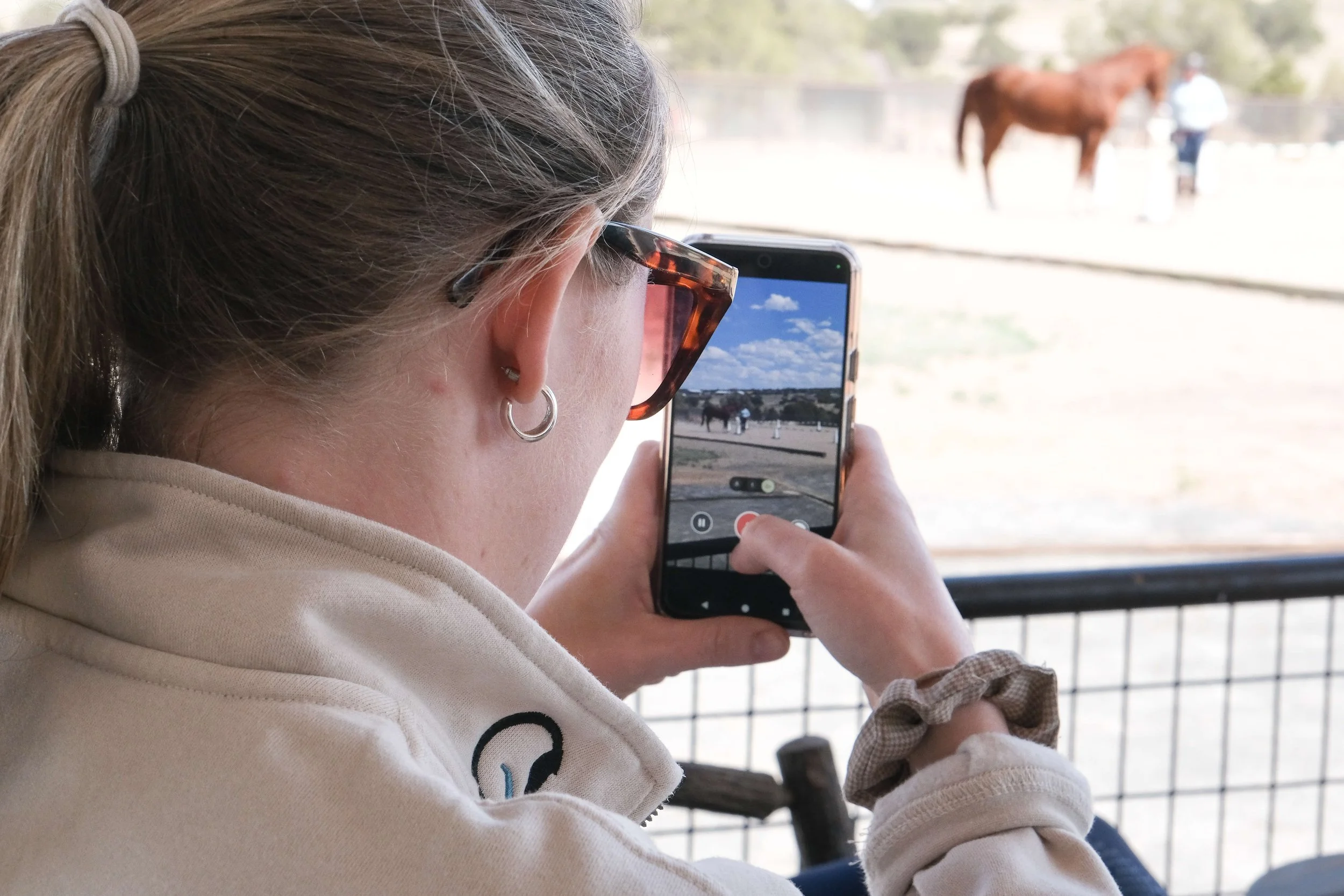
More than half of global web traffic now comes from mobile devices.
More than half of global web traffic now comes from mobile devices.
Mobile-first design is no longer a nice to have. More than half of global web traffic now comes from mobile devices, and Google ranks sites with mobile optimisation higher in search results. For equestrian businesses, this means a prospective client browsing your riding school on their phone or a sponsor checking your results after a competition will judge your professionalism by how seamless the experience is.
Performance is equally critical. Large image files, unoptimised video, or unnecessary animations can all slow loading speeds, frustrating visitors. In 2025, performance expectations have only increased, particularly on mobile connections. The do’s here are simple: compress images, prioritise clean coding, and regularly test your site across devices. The don’ts are equally clear: avoid auto-playing media, clunky forms that do not work on mobile, and any design choice that prioritises visual impact over usability. A fast, responsive site signals credibility and helps ensure visitors stay long enough to act.
Case in point: a professional rider listing horses for sale may rely on high-quality video footage. If that video takes too long to load on mobile, the potential buyer may leave the site before ever seeing the horse. Optimisation here is not cosmetic, it is commercial.
2. Clarity and the User Journey
Websites must guide visitors, not overwhelm them. Research on digital behaviour consistently shows that users scan rather than read in detail, making clarity a decisive factor in engagement. For equestrian brands, this means structuring your site so that core actions such as viewing sale horses, booking lessons, learning about services, or exploring sponsor visibility are intuitive and frictionless.
The “do” is to design around the user journey. Every page should lead somewhere meaningful, supported by clear calls to action like “Book a Lesson,” “Join Our Mailing List,” or “Enquire About Sponsorship.” Strategic signposts, including buttons, directional imagery, or contrasting colours, help guide the eye without shouting. The “don’t” is clutter. Overwhelming menus, endless text blocks, or competing calls to action confuse rather than direct. A visitor unsure of what to do next will almost always do nothing.
Clarity also supports modern discoverability. In 2025, AI-powered search tools increasingly surface content based on how clearly questions are answered and how logically pages are structured. Sites with clear hierarchy and scannable layouts are more likely to be referenced, even when users do not click through in the traditional sense.
For example, an event organiser might want visitors to buy tickets, explore the line-up, and learn about sponsors. If all of this information is hidden under vague menu labels, the opportunity is lost. Clear CTAs like “Book Tickets Now” or “Meet Our Sponsors” transform browsing into action.
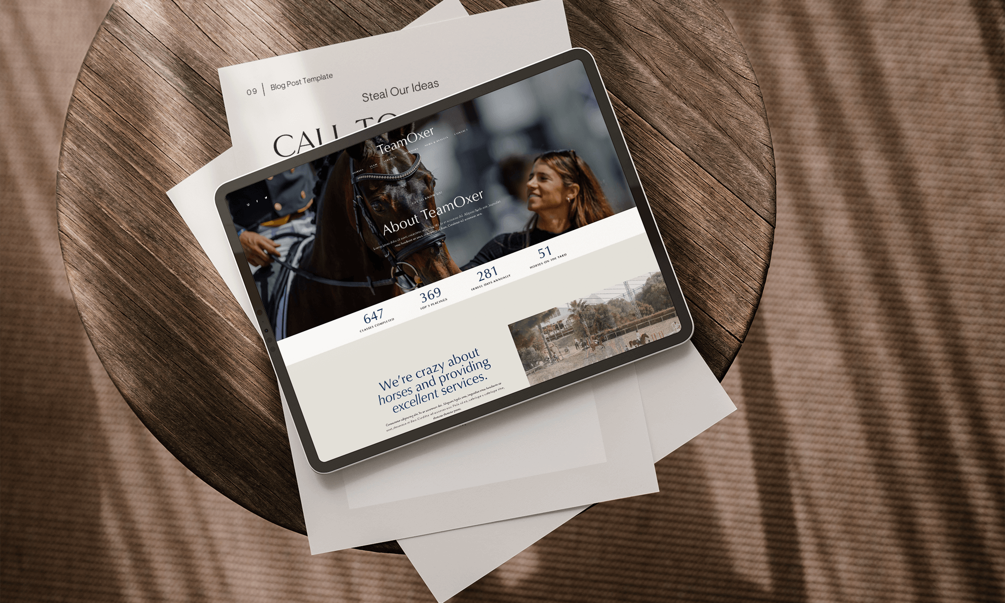
3. Visual Consistency and Brand Identity
Fonts, colours, and imagery are not decoration. They are signals of identity and professionalism. Do use a small, deliberate palette and no more than two or three typefaces. The right typography and colours reinforce your values. A heritage brand may opt for elegant serif fonts and warm neutrals, while a performance-focused athlete may choose bold sans-serif fonts and dynamic tones. Do not overload your site with decorative fonts, clashing colours, or stock imagery that looks generic or inauthentic.
Photography in particular carries weight in equestrian marketing. A polished, authentic image of a rider, horse, or facility communicates far more than words alone. Social media-ready imagery can be reused across channels, but on your website it must be optimised for performance and aligned with your brand’s personality. Consistency is what ties your visual language together, ensuring that your site feels trustworthy and recognisable to both users and sponsors.
Consider a luxury saddle brand. A sleek website with carefully chosen fonts, a muted colour palette, and professional photography of the product in use reinforces a message of quality and craftsmanship. The same brand using inconsistent fonts and generic stock photos would instantly feel less credible.
4. Trust, Credibility, and Social Proof
A website is not just about aesthetics, it is about establishing trust through perceived creditably.
A website is not just about aesthetics, it is about establishing trust. In equestrian sport, where clients are often making high-value decisions such as purchasing horses, booking training, or investing in sponsorship, credibility is paramount. Do include testimonials, case studies, or user-generated content that shows real impact. Highlight partnerships, rider achievements, competition results, or media coverage as tangible proof of reputation.
In 2025, trust signals also extend beyond visuals. Clear contact information, transparent messaging, and structured information all contribute to perceived legitimacy. Well-organised pages and accurate, up-to-date content help both users and AI-driven platforms assess credibility.
Do not underestimate how quickly trust can be undermined by intrusive design choices. Pop-ups that appear immediately, distracting animations, or broken links all signal carelessness and erode professionalism. Pop-ups, if used, should appear after engagement, not before. Avoid vague claims or exaggerated promises. Specificity builds confidence, while generalities create doubt.
For riders, this could mean showcasing recent competition results alongside sponsor logos and video highlights. For riding schools, it might mean testimonials from parents or students. These elements turn a site from self-promotion into a trusted resource.
Why Work With an Agency?
DIY platforms can get you online, but performance, discoverability, and credibility require more than templates. An agency brings strategy, combining design, copy, SEO, and analytics into a single process that ensures your site does not just look professional, but actively drives business.
At EQuerry Co, we specialise in equestrian websites that showcase results, build sponsor confidence, and integrate seamlessly into wider marketing strategies. From mobile-first design to AI discoverability, we create digital platforms that future-proof your brand.
Explore our branding and web services for more information, or book a call today.
5. Balancing Beauty with Functionality
The final principle is balance. A visually striking website that frustrates users is as ineffective as a plain one that fails to inspire. Function and beauty must work together to create a seamless, enjoyable experience that encourages visitors to take action.
This is where strategic design choices matter most. Do use aesthetic elements to enhance navigation, storytelling, and brand differentiation. Do not add features for the sake of novelty if they slow performance or confuse the journey. For equestrian brands, this might mean showcasing sale horses with high-quality video, but only if the video is optimised for fast loading and easy navigation. It might mean designing athlete profiles with strong imagery, but always supported by structured text that search engines and AI systems can interpret.
Balance is also about alignment with broader marketing goals. A site that looks beautiful but does not integrate with your social media, sales funnel, or SEO strategy is not delivering its full potential. Design is not separate from marketing. It is a vehicle for it.
Design With Strategy in Mind
The difference between a website that exists and a website that performs is strategy. Performance and mobile optimisation keep users on the page. Clarity ensures they know what to do next. Visual consistency signals professionalism. Social proof builds trust. Balance unites aesthetics with usability. Together, these principles transform a site from a digital brochure into a marketing engine.
In equestrian sport, where credibility and visibility underpin everything from client trust to sponsor ROI, these do’s and don’ts are more than design advice. They are business strategy. A professional website is an investment in the future of your brand, ensuring that every click reinforces your reputation, builds engagement, and drives measurable growth.
At EQuerry Co, we believe websites should never be treated as standalone projects. They should be integrated into the wider marketing ecosystem, aligned with social media campaigns, supported by SEO and AI discoverability, and constantly updated to reflect evolving goals. We specialise in creating equestrian websites that combine design, copy, and strategy into a single, cohesive platform that performs. Because in 2025 and beyond, design without strategy is just decoration, and in equestrian sport, your brand deserves much more than that.