

The Science Behind Your Brand’s Colours /
It’s pretty undeniable that the link between colour and brand identity is a strong one, and as you’re probably aware, each colour has various connotations of emotions and associations. Colour is a powerful communication tool and colour psychology can be used to trigger particular behaviours in your customers.
So what are your brand’s colours and how are they building and contributing to your overall image?
While researchers have been able to study human responses to individual colours, remember that this isn’t the be-all and end-all. For example, you might associate red with love and passion, but another person may associate it with blood or anger.
Here’s a quick overview of what your brand’s colour palette may be conveying…
Blue is one of the most common logo colours, which isn’t surprising as blue is thought to denote trust, confidence, loyalty and security. Depending on the hue of the blue, it can help to create a calm or even clean feel.
Red creates a split in opinion as to which emotions it denotes. Most often, businesses choose it when they’re looking for a bold and powerful, or exciting colour. However, it can also be associated with danger and rage.
Green is mostly used to create a fresh, natural and friendly feel. Green is often a very soothing colour that may compliment a compassionate or environmentally centred brand.
Yellow can evoke lots of positive emotions and stimulates playful, fun, confident and youthful feelings. These may not suit every brand’s feel but yellow certainly has a bright and happy overall feel.
Orange may symbolise confidence, success and sociability. It is often described as an optimistic colour, and can help give a cheerful warmth to a brand.
Purple is associated with royalty, luxury and maturity. It is a peaceful colour which can have spiritual connotations for some. Purple is also associated with creativity and imagination.
Pink is a light-hearted, sweet colour, which is often associated with romance and provides a fun and ‘cute’ feel.
White is a neutral, clean colour, associated with innocence, purity and perfection. It is a timeless colour with its simplicity and freshness.
And lastly, black gives a feel of sophistication and formality. When used effectively it can give a brand a luxury, sleek, or powerful presence.
IS IT REALLY THAT SIMPLE?
Unfortunately, we cannot rely solely on the information above, as there are so many factors which influence how we read colours. For example, certain colour combinations will provide different emotions to the ones set above. Using a classic example, green and red together are often associated with Christmas.
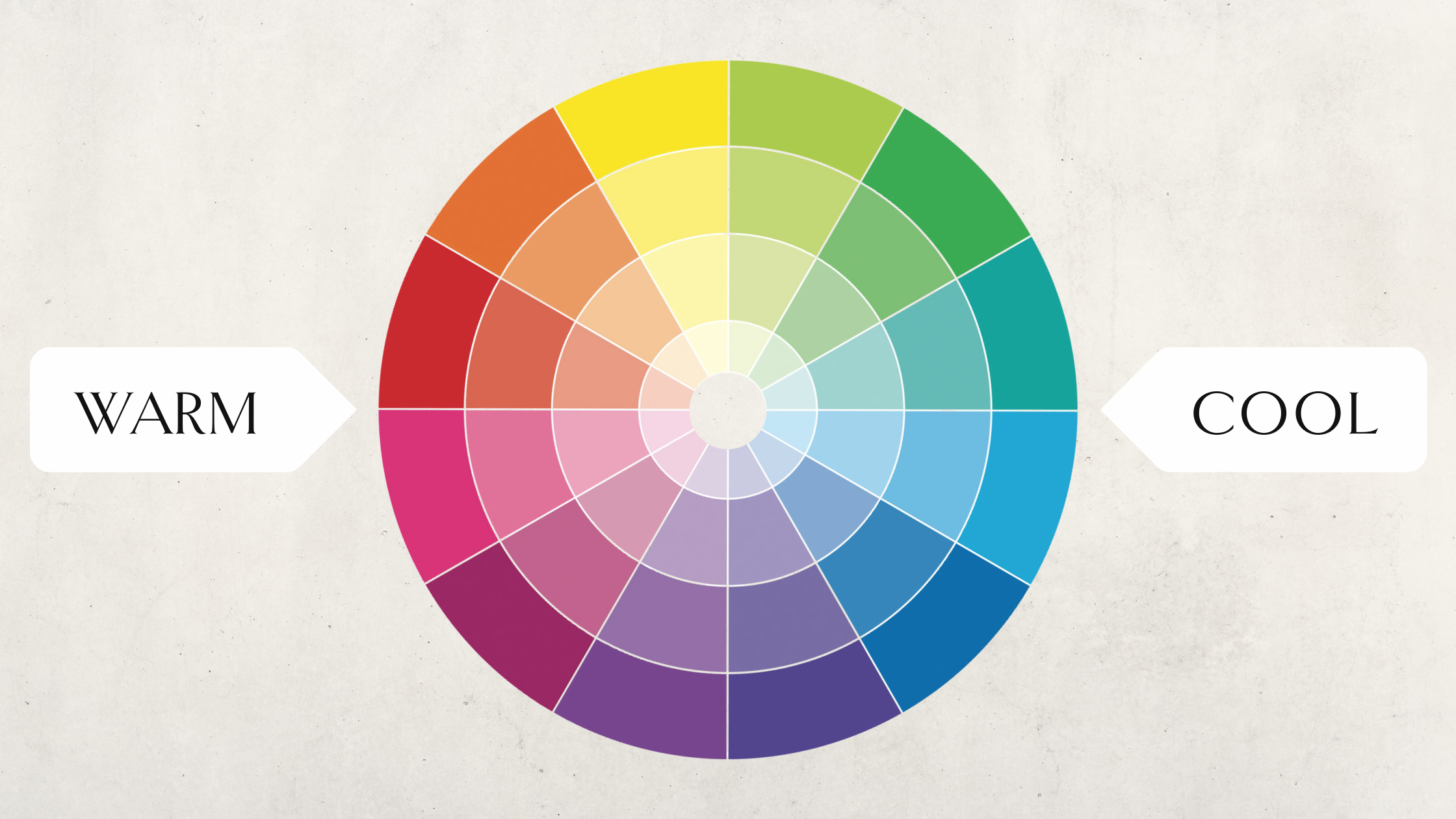
It is also important to consider the shade of your brand colour. For example a lighter blue may have more youthful, fresh feelings, but a darker navy blue feels more sophisticated and powerful.
You might have recognised how complicated colour theory in branding and marketing can be, but you can always seek advice from experts if you’re needing some guidance with your brand’s image.
Book a FREE discovery call with Christine if your equestrian brand could benefit from some advice and direction.